How to Choose the Right Palette for Your Brand

THOR: LOVE AND THUNDER

THOR: LOVE AND THUNDER

THOR: LOVE AND THUNDER

Introduction

A trading card product built around the cinematic energy of Thor: Love and Thunder, combining action-driven scenes with character-focused inserts. The goal was to translate the tone of the film into a collectible format that feels dynamic, bold, and engaging.

Main Discussion

Led the design of the full packaging system, including hobby and blaster boxes, along with foil wraps for both physical and digital (e-pack) products.

Each format was designed to feel consistent while adapting to different retail and user experiences.

Choosing the right color palette
Colors impact emotions

Key Takeaways

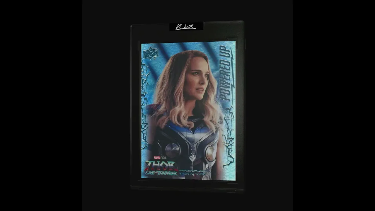
Contributed to multiple components of the set, including base cards, ensemble cards, autograph parallels, and the “Power Up” insert.

The card design supports the overall product, aligning with the visual language established through packaging.

Contact us

YOUR
THOUGHTS

Even if you want to just say  “I love this” Reach out!

REACH OUT

Name

Last name

Email

Phone no.

Contact us

YOUR
THOUGHTS

Even if you want to just say  “I love this” Reach out!

REACH OUT

Name

Last name

Email

Phone no.

Contact us

YOUR
THOUGHTS

Even if you want to just say  “I love this” Reach out!

REACH OUT

Name

Last name

Email

Phone no.

LETS CONNECT

I design across trading cards, branding, and product systems focused on clarity, direction, and real-world execution.

NIASOTOV

©2026 All right reserved.

LETS CONNECT

I design across trading cards, branding, and product systems focused on clarity, direction, and real-world execution.

NIASOTOV

©2026 All right reserved.

LETS CONNECT

I design across trading cards, branding, and product systems focused on clarity, direction, and real-world execution.

NIASOTOV

©2026 All right reserved.